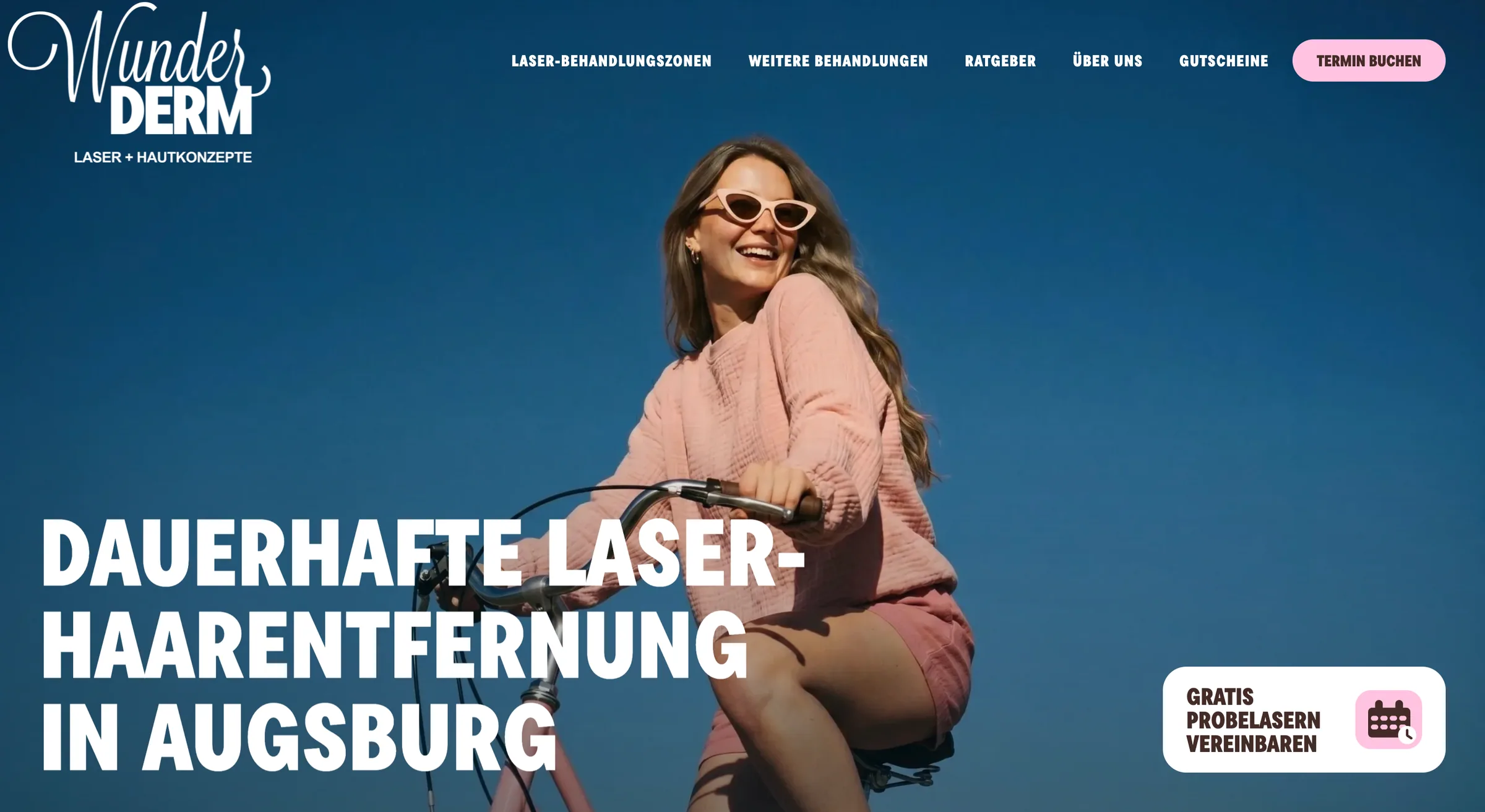
Client
WunderDerm
Market
Augsburg · Germany
Delivery
Brand · UX/UI · Next.js · Sanity · SEO migration
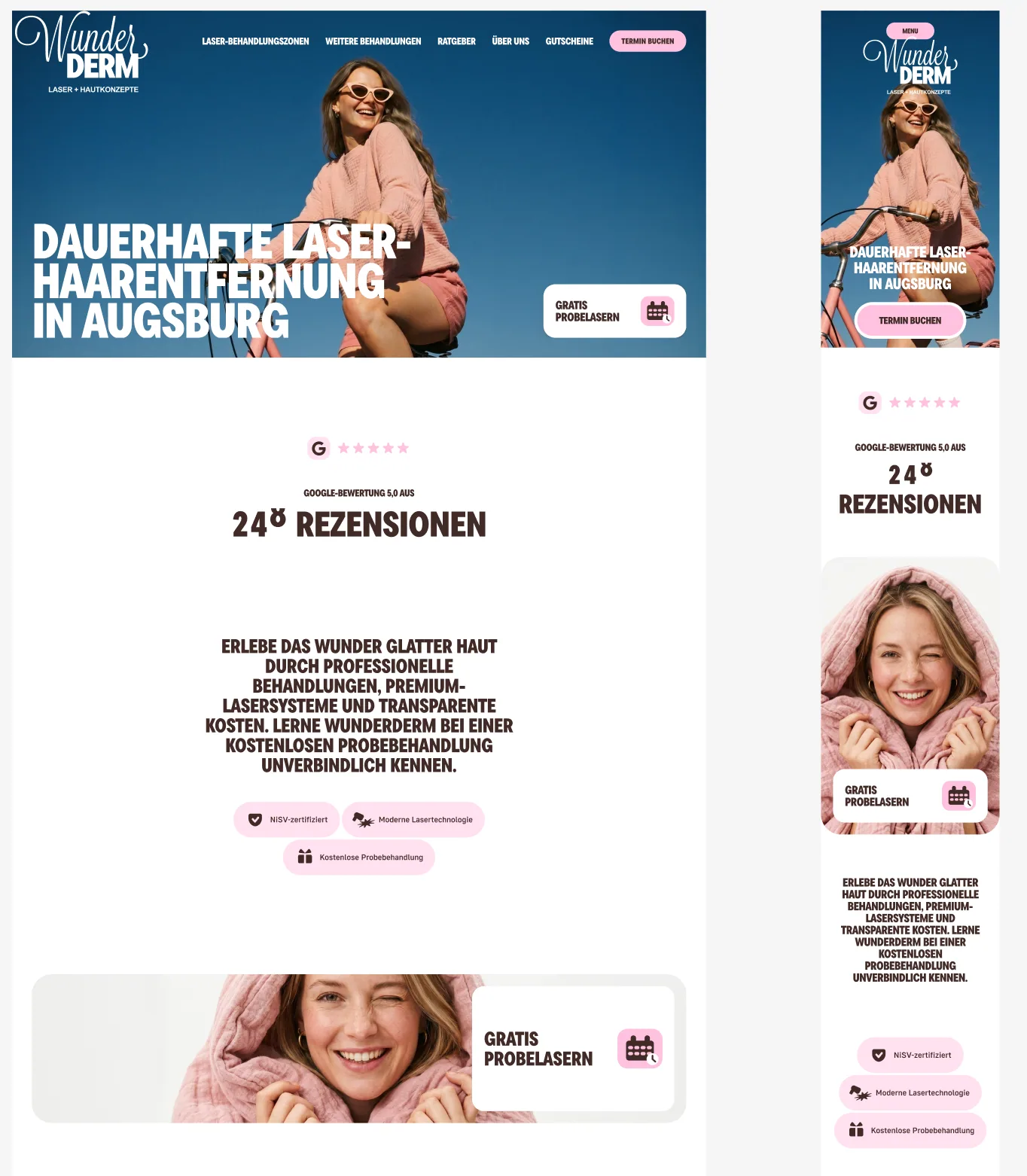
Respecting existing brand equity while changing the experience
WunderDerm already had recognition and a strong name. The opportunity was to retain that personality while moving beyond an older beauty-laboratory presentation and creating a clearer “Laser + Hautkonzepte” position.
A page-by-page WordPress structure had also made services, prices, technology and booking information harder to navigate. We reorganised the experience around the questions a customer actually brings: which area, which service, what price and what happens next.
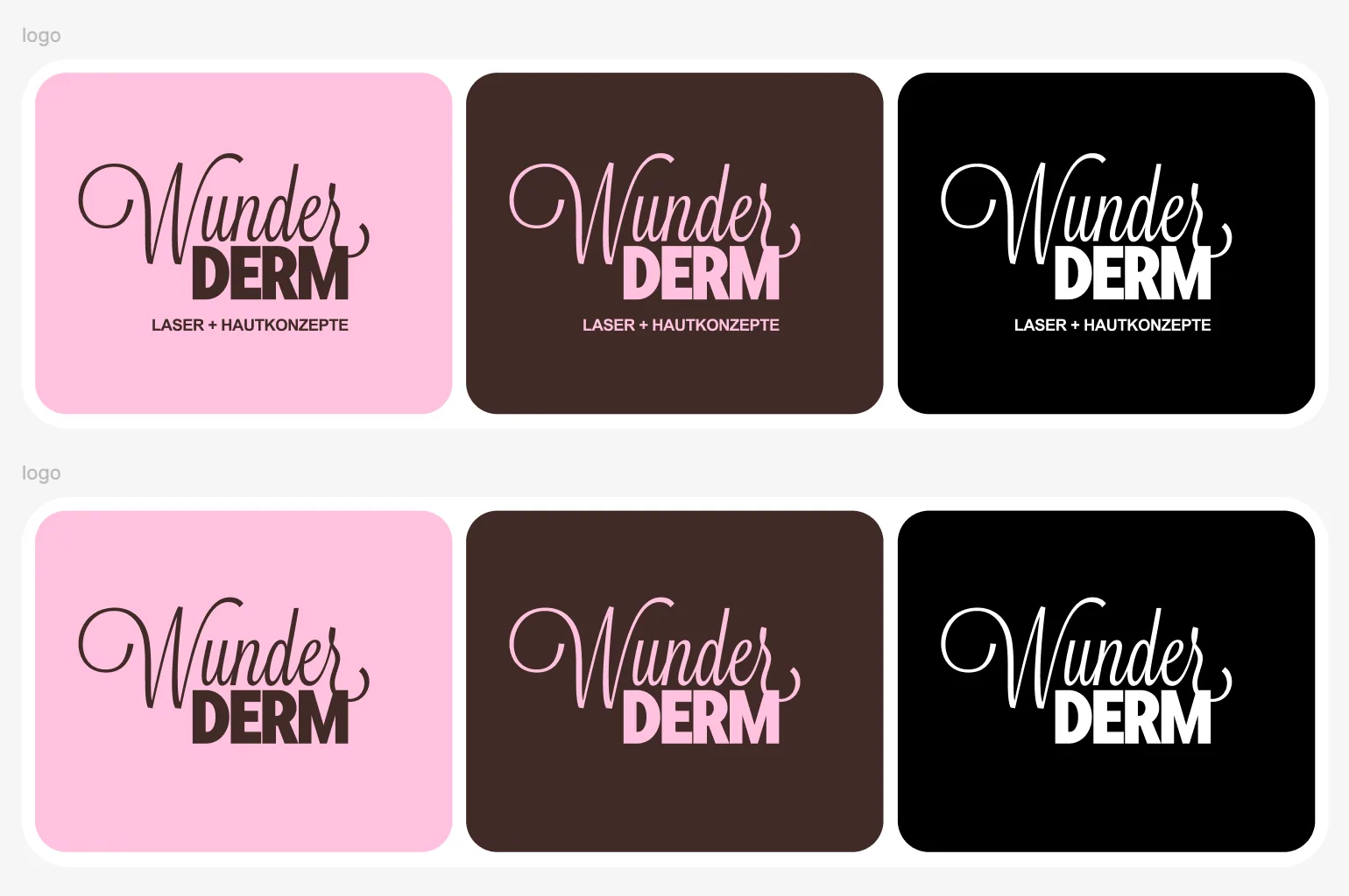
A visual language with enough range for a full service catalogue
The expressive wordmark remains the anchor. Deep blue adds confidence, while warm brown, vivid pink and off-white give editorial pages, cards and conversion moments different moods without losing consistency.
- Refined logo system and positioning line
- Reusable colour, typography, spacing and component rules
- Photography direction based on warmth and movement
- Desktop and mobile designed together
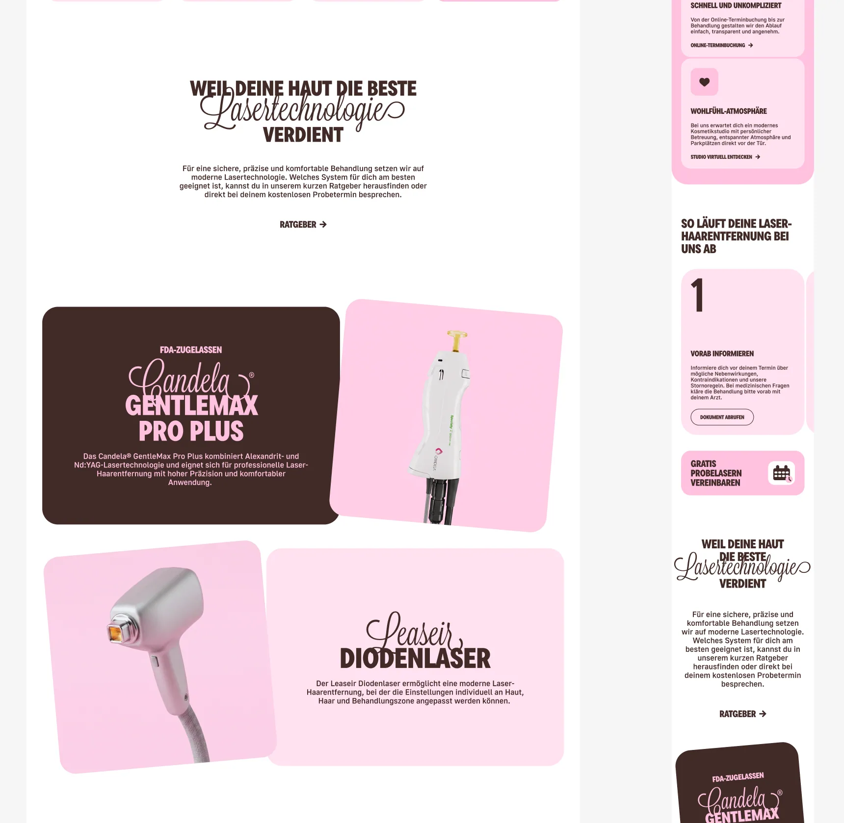
Service complexity translated into navigable product flows
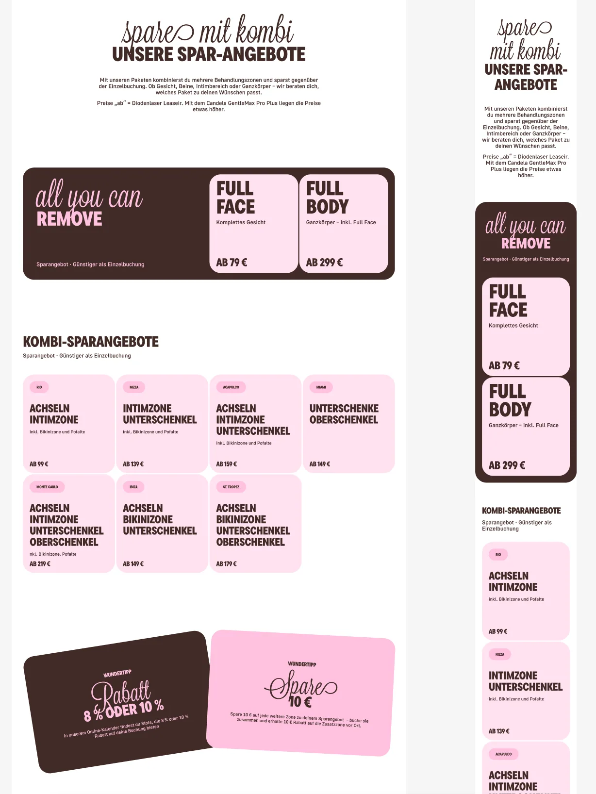
Treatment zones, packages, price views, contextual explanations and booking actions now behave as connected interfaces rather than isolated landing pages.
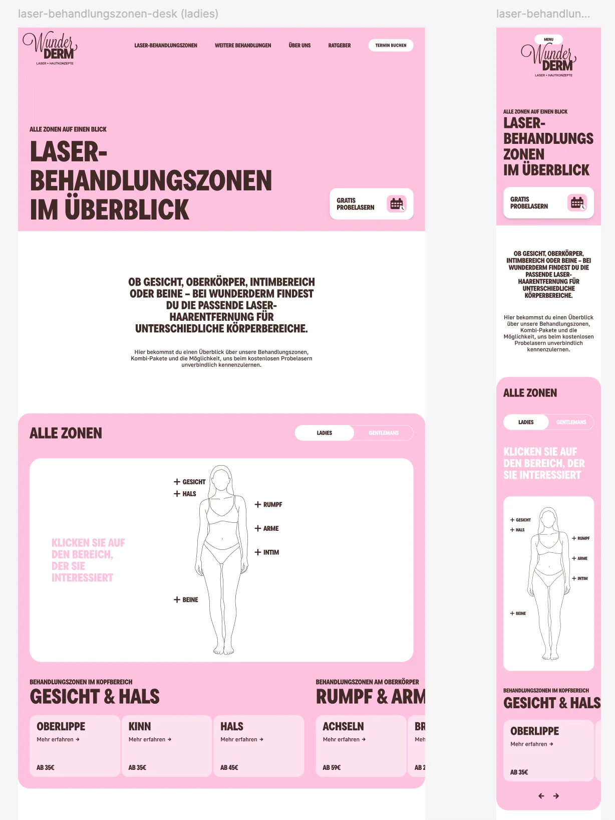
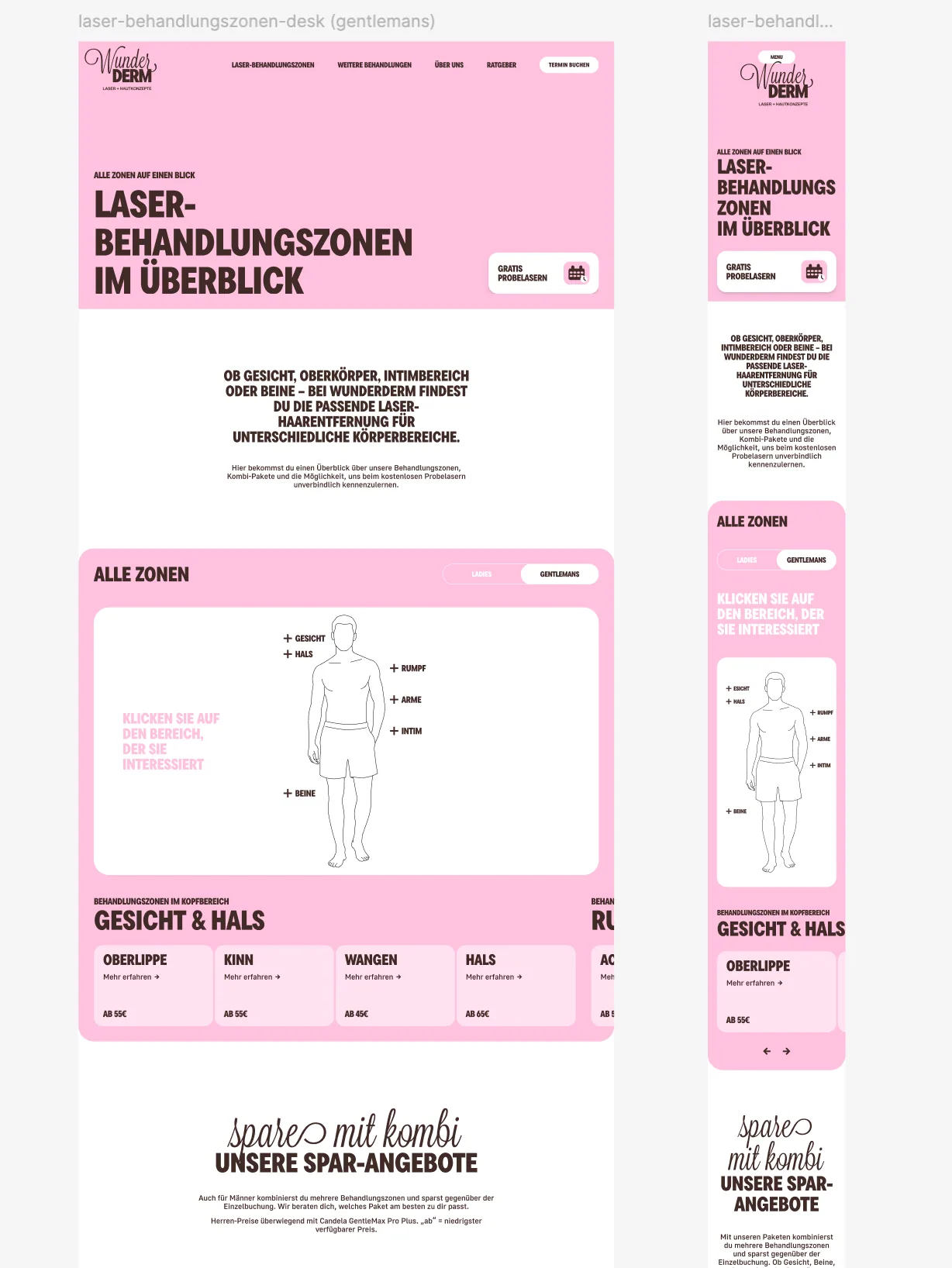
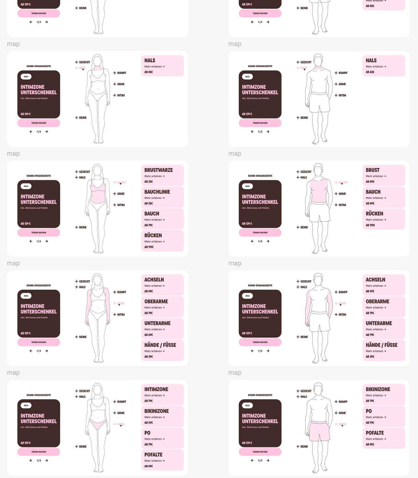
Interactive treatment-zone discovery
A responsive body map lets visitors choose a view, select a region and reach the relevant service information without working through a long flat price list.
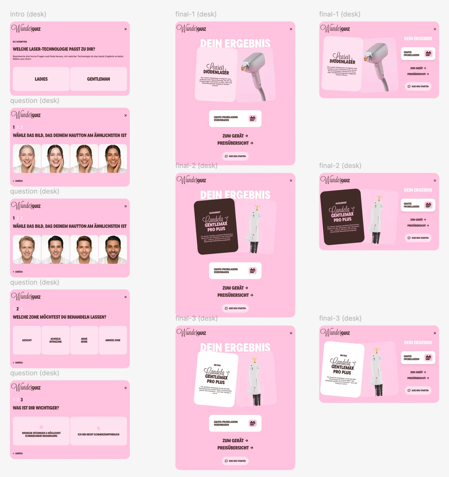
A short orientation flow with a clear boundary
WunderQuiz organises preferences and routes people to relevant information. It is positioned as orientation, not diagnosis or professional treatment advice.
An editorial microneedling story inside the same design system
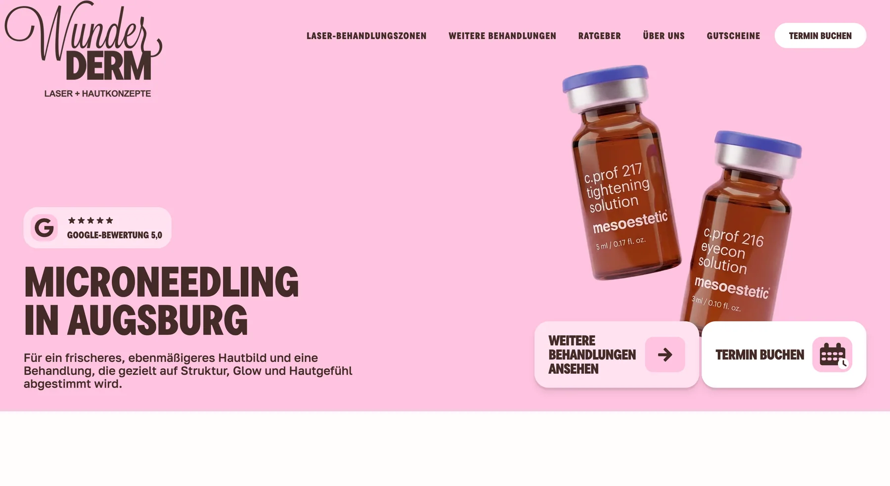
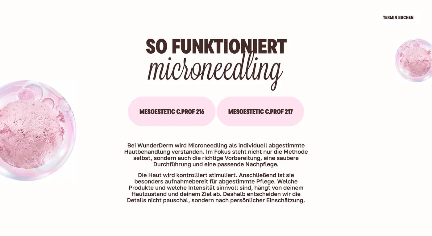
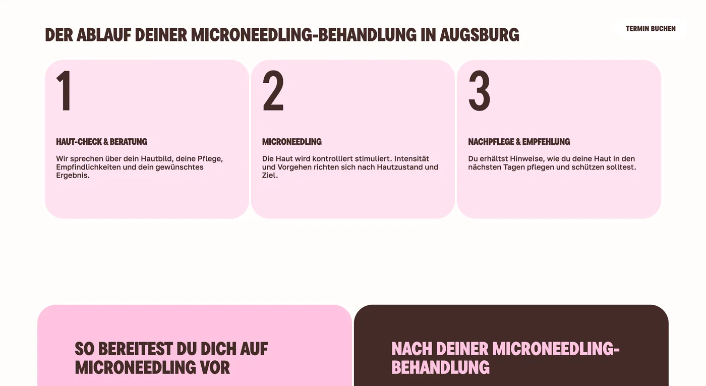
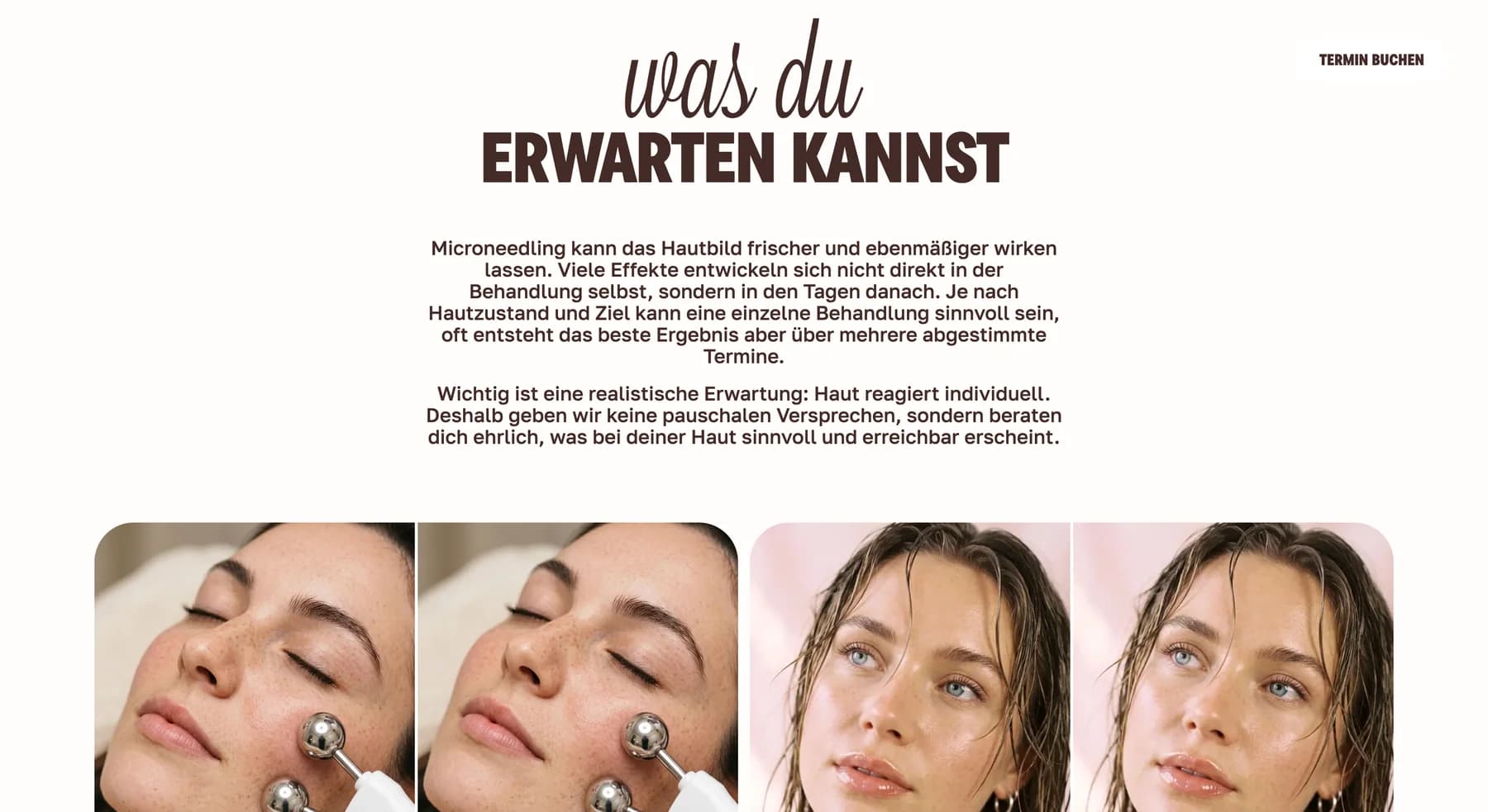
Microneedling needed a different pace from laser services: product-led imagery, explanation, process and practical preparation content. Shared navigation, typography and conversion patterns keep it part of the same brand.
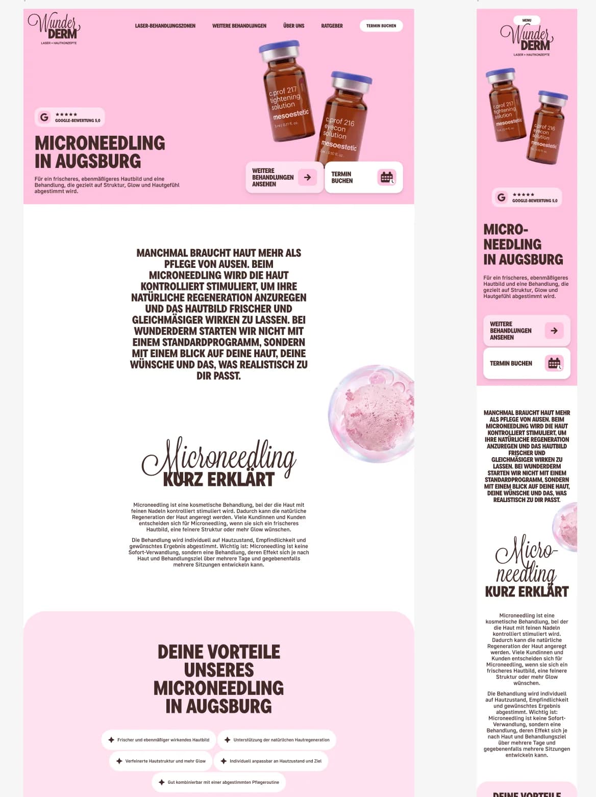
Full layouts and detailed page captures
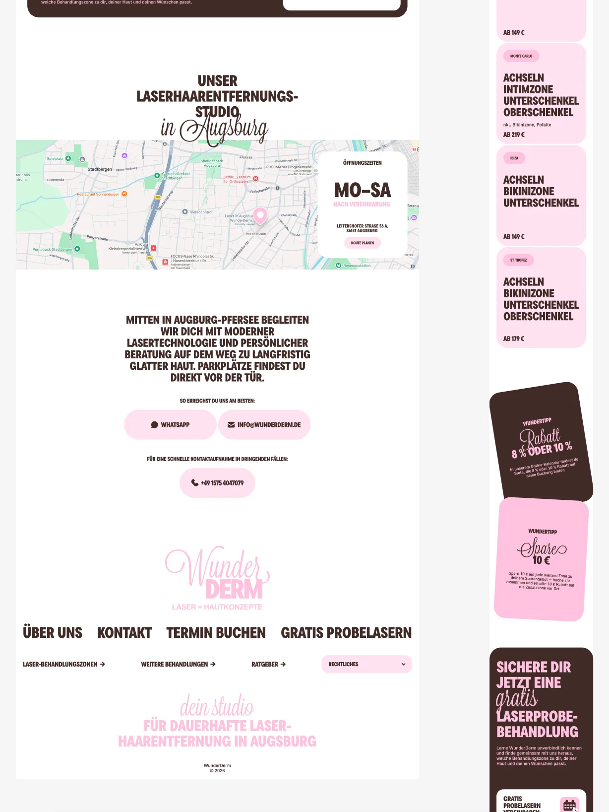
Desktop and mobile compositions were built in parallel. The selected screens show how the page moves from an offer-led opening into education, process and photography without becoming a disconnected microsite.
A maintainable platform behind the visual relaunch
The website was rebuilt as a typed Next.js application, with Sanity providing structured editorial control. The architecture supports service pages, articles, FAQs, reusable sections and future extensions without returning to a page-by-page builder model.
Outcome
WunderDerm now operates one coherent digital system across identity, service discovery, pricing, guidance, booking paths and content operations. The result feels more current without becoming unrecognisable to existing customers.
This case documents brand, interface and software work. It does not claim clinical efficacy or individual treatment outcomes.
More views from the system